
It's summer which naturally it means I'm also doing the very thing I shouldn't....and that's thinking ahead to next year.
It's hard for me to sit still and not use this time to think about how I'd like to setup my classroom, add or change things up, or create some new resources. My time is so valuable - don't get me wrong, our family has PLENTY planned for July - but it's even more valuable during the school year when I don't have much of it to dedicate to these things. So, I personally enjoy using this slower-paced time in my life to reflect and gear up for the year ahead.
So, as I'm looking around teacher Instagrams I'm noticing this boho naturals trend and I have to say that I'm not mad at it. I love that classrooms are beginning to get away from a lot of those distracting and overwhelming classroom decor and somewhat getting student-centered again. However, I do find a lot that is more style than substance...at least for me and what I would like to do for my kinders. Thus, I set out to create my own resources and here I am sharing what all I've been up to.
Student-Centered
This is by-far the most important thing I keep in mind when setting up my classroom. My son, who has ASD (Autism Spectrum Disorder), has taught me a lot over the years about overstimulation and how that may affect different kids. Overstimulation can trigger all sorts of behaviors in students and therefore I try to keep the sensory levels pretty minimal when it comes to how I decorate and organize my classroom. Calm students = focused, engaged, and happy learners!
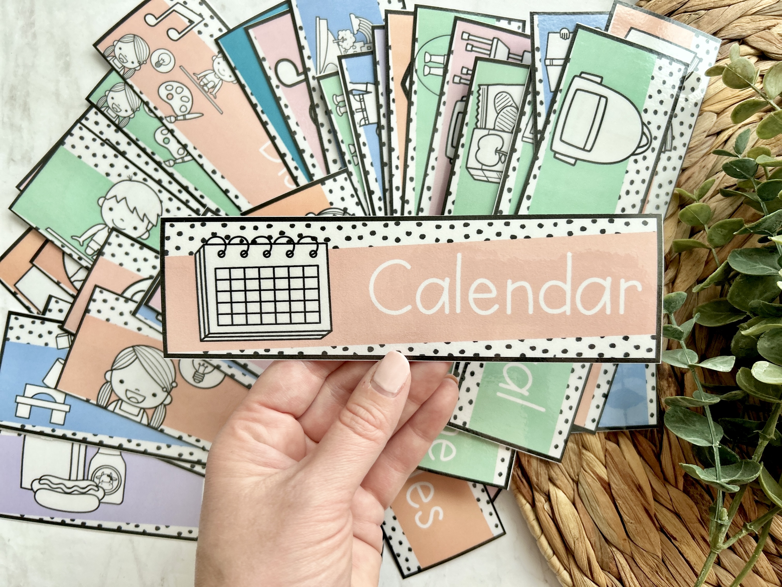
Daily Schedule Cards
As you can see my schedule cards this year are going to be black and white with little pops of color. The clipart I've intentionally kept black and white as to pop a little bit but not be overwhelming to the eye. The other important thing I keep an eye out is the use of fonts in products. So many times do I see something I'd love to download from TpT, but the font is completely wrong for my students here in kindergarten. Often they're a funky script or even the all caps fonts can be challenging to read...so cute for us adults scrolling social media, but not very student-friendly. Especially students who are just learning to read and write.
In my own products I always keep to simple fonts that reinforce the types of letter formation that I am teaching my students and what I expect for them to reproduce for me in their own writing. It also makes it easy-to-read and the B&W clipart is simple and doesn't overwhelm the eyes. Who knew so much thought goes into something as simple as this!


